



Focus
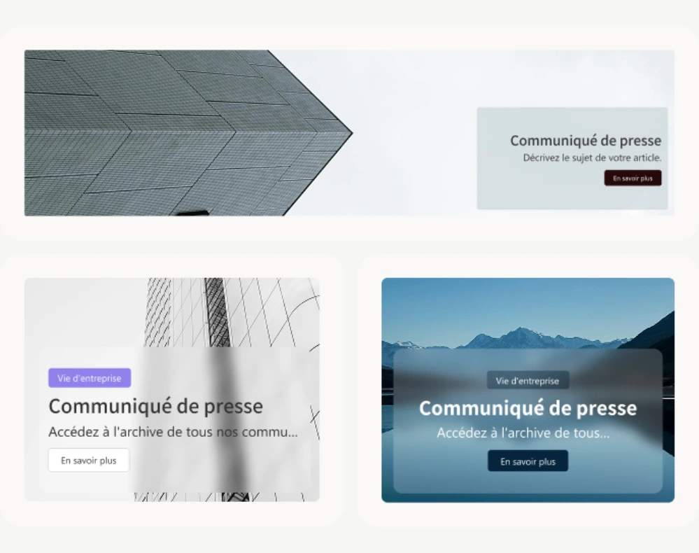
Spotlight what matters most with a fully customizable visual block.
Highlight what truly matters to capture attention and drive engagement. Focus combines image, text, and call-to-action buttons in a single customizable block, so you can feature critical information anywhere on your SharePoint intranet, not just the homepage. Teams use it for crisis or priority announcements, onboarding resources for new hires, upcoming deadlines and events, HR and CSR campaigns, quick links to business-critical tools, and mandatory documents like charters or policies employees need to read or acknowledge. Choose between a modal or panel display for extra interactivity, resize and reposition the block to fit any page layout, and import your own fonts and colors to match your brand identity down to the pixel. Because Focus sits above the native SharePoint highlighted content web part, it gives communicators far more design control without touching a line of code, and it pairs naturally with Image Map or Flexible Sections when you need a richer visual story on the same page.


Frequently asked questions about Jint.
What is the Focus web part in SharePoint?

Focus is a customizable content block that combines an image, text, and a call-to-action to spotlight a key message on any SharePoint page.
What can we use the Focus web part for?
Common uses include crisis or priority announcements, onboarding resources, upcoming deadlines, HR campaigns, and quick links to business-critical tools.
Can we match Focus to our brand identity?
Yes. Import your own fonts into SharePoint and choose between modal or panel display to match your visual identity and add interactivity.
Can Focus link to an external Power App or business tool?
Yes, the call-to-action can open a link or launch a Power App directly from the SharePoint page, so Focus doubles as a shortcut to business-critical tools.
Is Focus limited to a single message per page?
No, you can place several Focus blocks on the same page to highlight different priorities, such as a crisis alert at the top and an onboarding resource further down.


